
At The Heart Of My Evidence-Based Design Art
Art marketing experts and advisors have been telling me for years that I need to pick one art category and paint in it.
I tried to stay in one art category, figuring that my sales figures would eventually show me the right direction to take, but then I kept selling and selling in all of my categories.
Next, I thought I’d find my one big winning category when my art got viewed by art curators from around the world. If you look at my dorotheasandraart.com website’s first page and scroll down to the 2025 International Curations, you’ll laugh. I haven’t posted them all, but right now, I am in 44 different international art curations—and the art curators seem to like my art in all the different categories and styles I paint.
Thankfully, it was my evidence-based design knowledge and training that eventually helped me understand that I really do have one central item running through all of my art:
I discovered that—whether it’s a painting about sustainability, an evidence-based design floral impressionism, a water-inspired movement composition, or even an intense abstract—AT THE HEART of every single one of my paintings are elements of LOVE and CARE.
If the inside of my art could speak, it would say, “In this painting is love and caring about human health and happiness.”

The Happiness Factor by Dorothea Sandra, EDAC, 5’x8’


Using my Evidence-Based Design Certification (EDAC) training, the colors are bright, cheerful, and welcoming. Viewers can see through the stems, which scientific studies have shown to create safety in human minds. Flowers rooted in soil suggest a continuation of life, unlike cut flowers in a vase, which will soon die. The yellow sun, with its healthy-looking morning glow, gives many viewers the feeling that “survival” will be easy, which creates chemicals in the brain (like dopamine) that make humans feel happiness.
At the heart of this painting is a deep care for human health and happiness.

Happy Sustainable Memories by Dorothea Sandra, EDAC, 5’x8’
This next painting, Happy Sustainable Memories, is an entirely different style of art, but at its heart—like in The Happiness Factor—is a sincere caring about human health and happiness.
In evidence-based design and art, local scenery is often suggested as a composition. Instead of focusing on a snapshot of a local scene, I chose in this painting to take in an entire journey within a local area and represent it through art.
The composition was inspired by nature and a trip from Pasadena, California, along the super busy Foothill Freeway on my way into the desert area near Palm Springs. In this painting, I chose the cheerful colors of yellow, muted pink, and orange to represent the mountains. There is an abundance of sand in the desert, so I used Liquitex’s professional-level unbleached titanium/beige (with a touch of gold) color for the painting’s sky and background. In evidence-based design, you don’t need to portray everything realistically; for instance, creating a blue sky isn't always necessary.
For people/patients who know the area, this painting—in a fun and happy abstract/expressionism/impressionism style—reassures and comforts and recenters them by visually connecting them to their nature-filled and sustainable beautiful local scenery.


This next style of art—where many of my SMART CITY ART series abstract paintings were featured at the 2025 SRI Sustainability Research and Innovation International Congress in Chicago—radically differs from most of what I do.
At first, I was confused and thought, “Here I go again, taking off into yet another different direction.” It took some time, and again, I believe my evidence-based design training and certification helped me understand that underneath even these abstract paintings was this same caring and love for human health and happiness.
My SMART CITY ART abstract series is about caring about human health and happiness, not just individually, but collectively within communities.
Each painting has a smart city technology and sustainability message and a fun, happy, modern flow. In addition, embedded within each painting’s composition are smart city technology and sustainability symbols and iconography.
The paintings include scientifically acknowledged elements that lead to improved human health and happiness: nature-based solutions, blue areas, 15-minute walkability, financial equity, governance, and so much more.

My art at the 2025 SRI Sustainability Research and Innovation International Congress in Chicago, USA.

Smart City Green, Smart City Equity, and Smart City Collaboration

Pretty City Art

Dynamic Cities Of The Future
Even within these dark and ominous paintings below, I realized that my love and care for human health and happiness was still the motivation at the bottom/heart/soul of all of my art. It was the energy behind everything that gave all of my paintings life.
In Middle Class Anger, I was concerned for human health and happiness as I watched the U.S. middle class lose economic stability and standing. In Chaos Enjoying Power, which was created about a month before the first “NO KINGS” rally even occurred, I was worried that power in chaotic hands would harm people and reduce human health and happiness.

Middle Class Anger
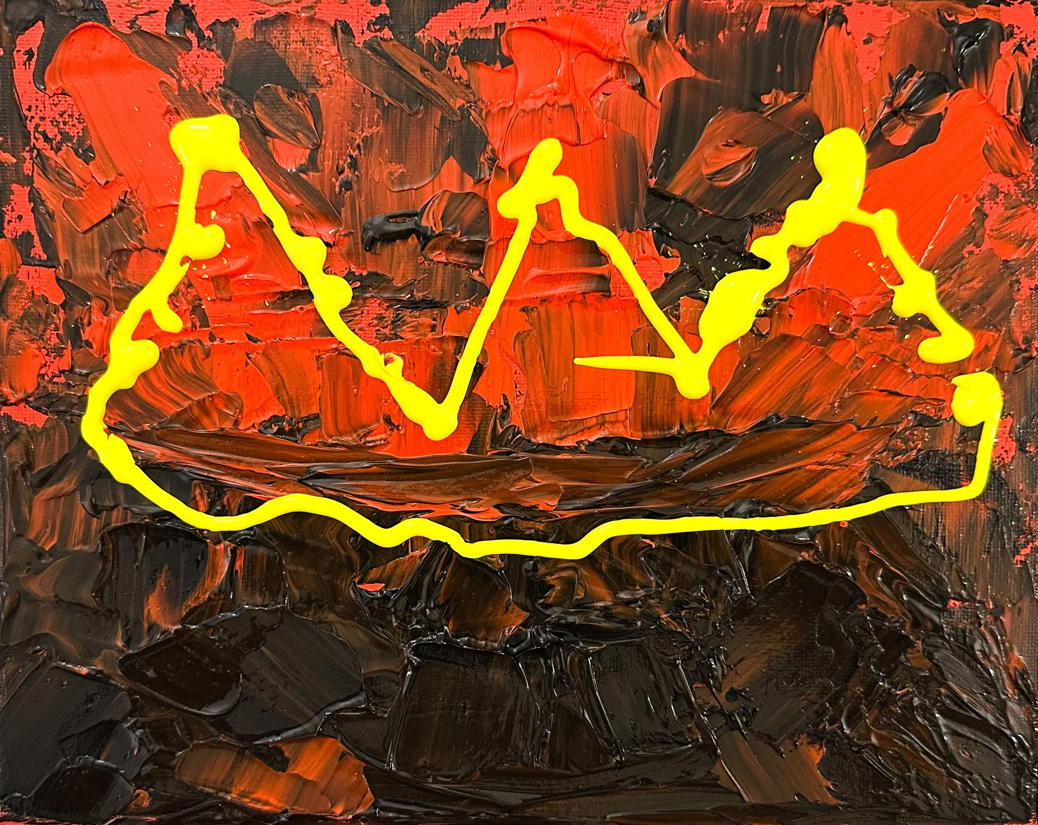
Chaos Enjoying Power
With my floral impressionism art featured on the 2025 cover of Healthcare Design magazine, all the way to this dark and sinister abstract art video below from Opulent Art in London, it seems as if my art is all over the place—but it isn’t.
The message is always the same: A care of human health and happiness is what my paintings are all about!
(In the video, starting around 2:30 minutes, Chaos Enjoying Power holds a premium place.)
Different Types Of Evidence-Based Design
There’s Evidence-based Design, and then there’s NOT Evidence-based Design.
Here are a few evidence-based design art guidelines. Many of these guidelines come from “A Guide to Evidence-based Art” from The Center For Health Design, research by Ulrich and Gilpin, a case study on best practices in evidence-based design by the Mays Clinic at the MD Anderson Cancer Center, and so much more.
Landscapes
They can be regional, generic, or seasonal. They should have visual depth or open foreground. Trees should have a broad canopy. Savannah and park-like landscapes are preferred by many. Vegetation should be lush. Empty park benches and sunsets should be avoided. The empty park bench might remind someone of loss and loneliness. A sunset might represent the end of life.
Florals
Florals should include familiar shapes of plants and flowers. They should appear healthy and fresh, and flower colors should be vibrant. Gardens and bouquet styles are acceptable. Flowers in vases should be used sparingly and only for variety.
Taking scientific or medical study results and turning them into artistic creations is not the easiest thing to do. There are no step-by-step guides to follow, and the rules need to be there, but sometimes they need a little bending.


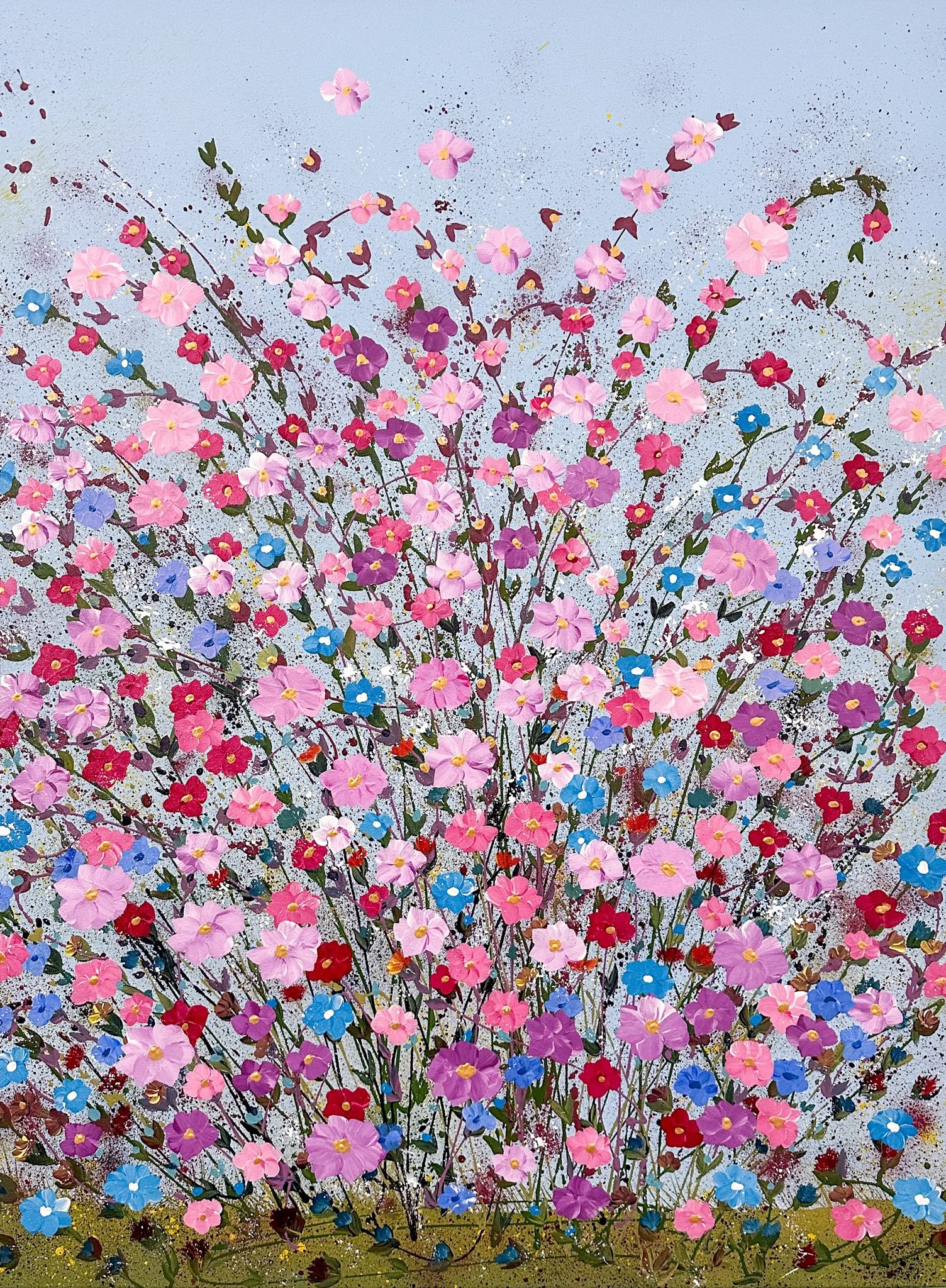
The painting above, Healing Flowers, spent time on exhibit in a museum and then in a gallery. It recently sold, in 2025, to an art collector in Fort Worth, Texas. Also, in Jan/Feb 2025, it was featured on the cover of Healthcare Design Magazine. In addition, in 2024, I was also asked to show it in another issue of Healthcare Design Magazine issue. On one international art gallery website, this painting received thousands of views.
While creating it, I tried to adhere to the evidence-based landscape design guidelines for healthy outcomes. By following the rules, I figured I could trigger the brain to create dopamine, which would produce in its viewers feelings of happiness.
If you look closely, you can see through the stems, which gives viewers visual depth. According to the research, seeing through the stems helps humans feel safe. It takes us back to our days of hunting on the Savannah, where dangerous animals could hide in thick grass and then attack us. While the stems were thin, I ensured the flowers appeared lush and abundant. Again, this would suggest an abundance of food.

Healing Abundance by Dorothea Sandra, EDAC
Using the same evidence-based design guidelines, Healing Abundance also sold in early 2025. It was sold from a gallery in Paris, France, and shipped to a company in Hong Kong with television channels in Hong Kong, mainland China, Macau, and other Chinese-speaking areas. The soil and stems are there, but I wanted to add lush vegetation through the flowers.
Years ago, when I was living in Asia, a good friend who was also a medical doctor ended up in the hospital. I went to visit her with a bouquet of cut flowers in hand. After she got out of the hospital, she told me that a bouquet of flowers was not the best gift. A potted plant would have been more appropriate. When I asked why, she explained that cut flowers will soon die, while a plant in soil continues to live on.
Most everything I do in the creation of an evidence-based design painting is for the health and happiness of viewers.


Inside Evidence-Based Design Art
If you walked past this painting in a healthcare hallway, would your brain receive a message of love without being overly impacted or stressed by the art?
I do not have the expertise of a neuroscientist or medical researcher or practitioner, but I do LOVE to study their evidence-based design results and find ways to experiment with them in art.

Symphonies Of Love Number 12 by Dorothea Sandra, EDAC
This painting was strategically and deliberately designed using evidence-based design principles and guidelines.
My first goal for this painting was to create a soothing, stress-free background. A large body of research is consistent with the proposition that humans are hard-wired to appreciate and benefit from exposure to nature. I chose the color green for the background because green gardens and parklike settings are acceptable in evidence-based design. I could have added some dabs or splatters to the background, but I decided a super smooth, flat background would create beauty without impact or stress.

My next goal was to decide on a composition. I chose the shape of a heart because I wanted to very clearly and very powerfully create a message that said, “You are loved.” I find too much evidence-based design art today wispy and without form. I think those designs are truly wonderful and quite celebratory of nature, but sometimes humans—especially children—need a clear, up-in-your-face message, especially of love.
Can you imagine a child in this patient bed? I think an image of a heart outperforms a typical biophilic design when it comes to encouraging feelings of love, safety, and care.

My third goal for this painting was to add some fine art flair. Nationally and internationally, people have begun to recognize my signature style of making flowers and they like them. As I am forming the flowers, I use a variety of art techniques to build in and create feelings of happiness and joy.
Keeping with my evidence-based design goal of beauty without impact, I very minimally added a pistil tip to each flower.
If you walked past this painting in a healthcare hallway, would your brain receive a message of love without being impacted or stressed by the art?


