
At The Heart Of My Evidence-Based Design Art
Art marketing experts and advisors have been telling me for years that I need to pick one art category and paint in it.
I tried to stay in one art category, figuring that my sales figures would eventually show me the right direction to take, but then I kept selling and selling in all of my categories.
Next, I thought I’d find my one big winning category when my art got viewed by art curators from around the world. If you look at my dorotheasandraart.com website’s first page and scroll down to the 2025 International Curations, you’ll laugh. I haven’t posted them all, but right now, I am in 44 different international art curations—and the art curators seem to like my art in all the different categories and styles I paint.
Thankfully, it was my evidence-based design knowledge and training that eventually helped me understand that I really do have one central item running through all of my art:
I discovered that—whether it’s a painting about sustainability, an evidence-based design floral impressionism, a water-inspired movement composition, or even an intense abstract—AT THE HEART of every single one of my paintings are elements of LOVE and CARE.
If the inside of my art could speak, it would say, “In this painting is love and caring about human health and happiness.”

The Happiness Factor by Dorothea Sandra, EDAC, 5’x8’


Using my Evidence-Based Design Certification (EDAC) training, the colors are bright, cheerful, and welcoming. Viewers can see through the stems, which scientific studies have shown to create safety in human minds. Flowers rooted in soil suggest a continuation of life, unlike cut flowers in a vase, which will soon die. The yellow sun, with its healthy-looking morning glow, gives many viewers the feeling that “survival” will be easy, which creates chemicals in the brain (like dopamine) that make humans feel happiness.
At the heart of this painting is a deep care for human health and happiness.

Happy Sustainable Memories by Dorothea Sandra, EDAC, 5’x8’
This next painting, Happy Sustainable Memories, is an entirely different style of art, but at its heart—like in The Happiness Factor—is a sincere caring about human health and happiness.
In evidence-based design and art, local scenery is often suggested as a composition. Instead of focusing on a snapshot of a local scene, I chose in this painting to take in an entire journey within a local area and represent it through art.
The composition was inspired by nature and a trip from Pasadena, California, along the super busy Foothill Freeway on my way into the desert area near Palm Springs. In this painting, I chose the cheerful colors of yellow, muted pink, and orange to represent the mountains. There is an abundance of sand in the desert, so I used Liquitex’s professional-level unbleached titanium/beige (with a touch of gold) color for the painting’s sky and background. In evidence-based design, you don’t need to portray everything realistically; for instance, creating a blue sky isn't always necessary.
For people/patients who know the area, this painting—in a fun and happy abstract/expressionism/impressionism style—reassures and comforts and recenters them by visually connecting them to their nature-filled and sustainable beautiful local scenery.


This next style of art—where many of my SMART CITY ART series abstract paintings were featured at the 2025 SRI Sustainability Research and Innovation International Congress in Chicago—radically differs from most of what I do.
At first, I was confused and thought, “Here I go again, taking off into yet another different direction.” It took some time, and again, I believe my evidence-based design training and certification helped me understand that underneath even these abstract paintings was this same caring and love for human health and happiness.
My SMART CITY ART abstract series is about caring about human health and happiness, not just individually, but collectively within communities.
Each painting has a smart city technology and sustainability message and a fun, happy, modern flow. In addition, embedded within each painting’s composition are smart city technology and sustainability symbols and iconography.
The paintings include scientifically acknowledged elements that lead to improved human health and happiness: nature-based solutions, blue areas, 15-minute walkability, financial equity, governance, and so much more.

My art at the 2025 SRI Sustainability Research and Innovation International Congress in Chicago, USA.

Smart City Green, Smart City Equity, and Smart City Collaboration

Pretty City Art

Dynamic Cities Of The Future
Even within these dark and ominous paintings below, I realized that my love and care for human health and happiness was still the motivation at the bottom/heart/soul of all of my art. It was the energy behind everything that gave all of my paintings life.
In Middle Class Anger, I was concerned for human health and happiness as I watched the U.S. middle class lose economic stability and standing. In Chaos Enjoying Power, which was created about a month before the first “NO KINGS” rally even occurred, I was worried that power in chaotic hands would harm people and reduce human health and happiness.
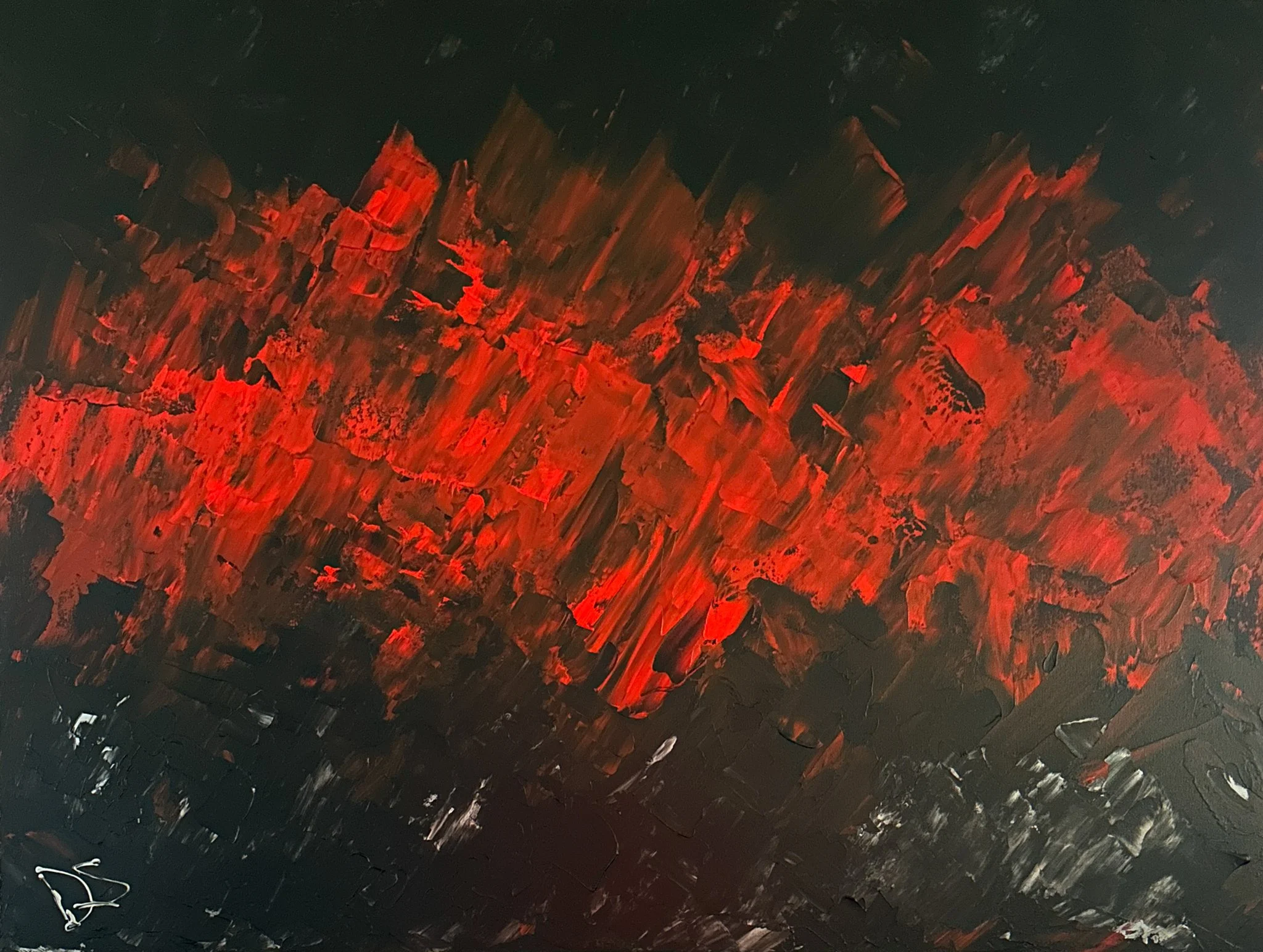
Middle Class Anger
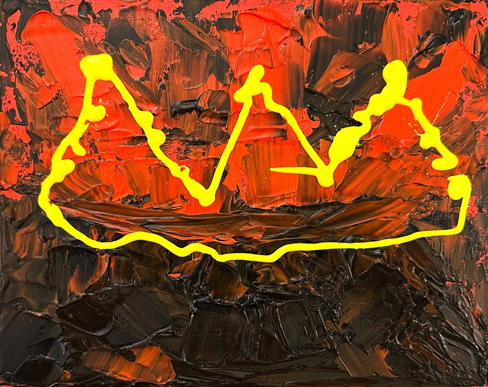
Chaos Enjoying Power
With my floral impressionism art featured on the 2025 cover of Healthcare Design magazine, all the way to this dark and sinister abstract art video below from Opulent Art in London, it seems as if my art is all over the place—but it isn’t.
The message is always the same: A care of human health and happiness is what my paintings are all about!
(In the video, starting around 2:30 minutes, Chaos Enjoying Power holds a premium place.)