Water, Healing, and Evidence-Based Design

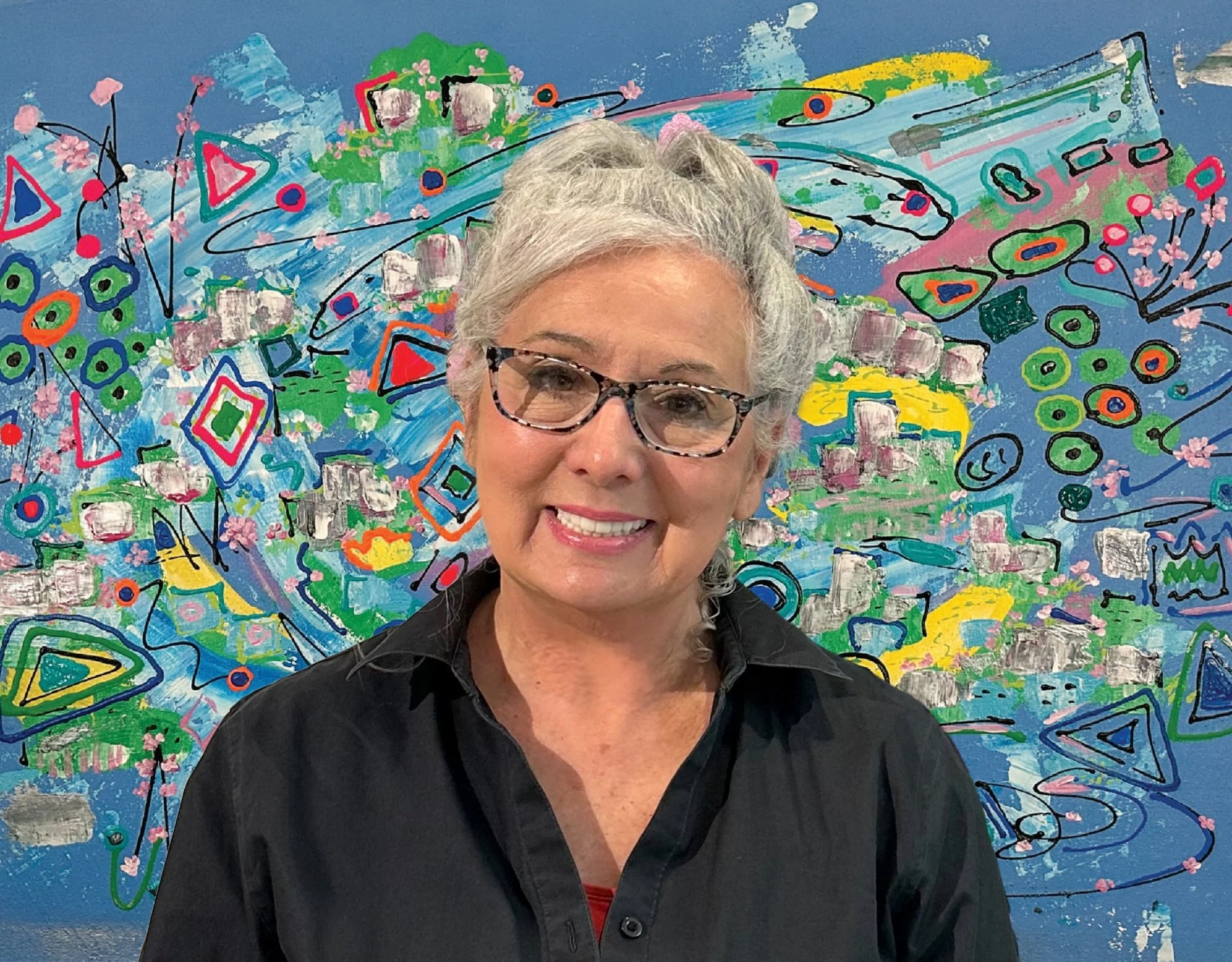
Beautiful Dreamer by Dorothea Sandra, EDAC
I’m always looking for new ways to improve myself as an evidence-based design artist. To do this, I read lots of medical/scientific study articles, with many of them coming from The Center For Health Design.
According to a number of scientific studies, nature-based visual art and nature-based sounds can positively impact healing. One study even clearly showed that nature-based positive distractions can positively impact patient perception of pain.
In this blog, some of the information comes from my book, 100 Days of Happy Happy Art, Evidence-Based Design, which is about my artistic journey into the world of evidence-based design.
Water is one of the more important elements of nature. It has been a symbol of life, change, the unconscious, purification, flexibility, forgiveness, and more.
Cultures throughout time have had different meanings and interpretations for water. Native American tribes honored it. Ancient Greeks saw it as a symbol of power. In Taoism, water remains a symbol for virtue and the highest goodness.
In evidence-based art, compositions with water should evoke healing. “Calm water scenes are preferred, while gushing rapids or crashing ocean waves should be avoided. Even a trickling water fountain might create negative experiences for people with full bladders or nonfunctioning bladders.” (Distinctive Art Source, “Healthcare Art Bloopers,” 2013)

The Tempest by Dorothea Sandra (SOLD)
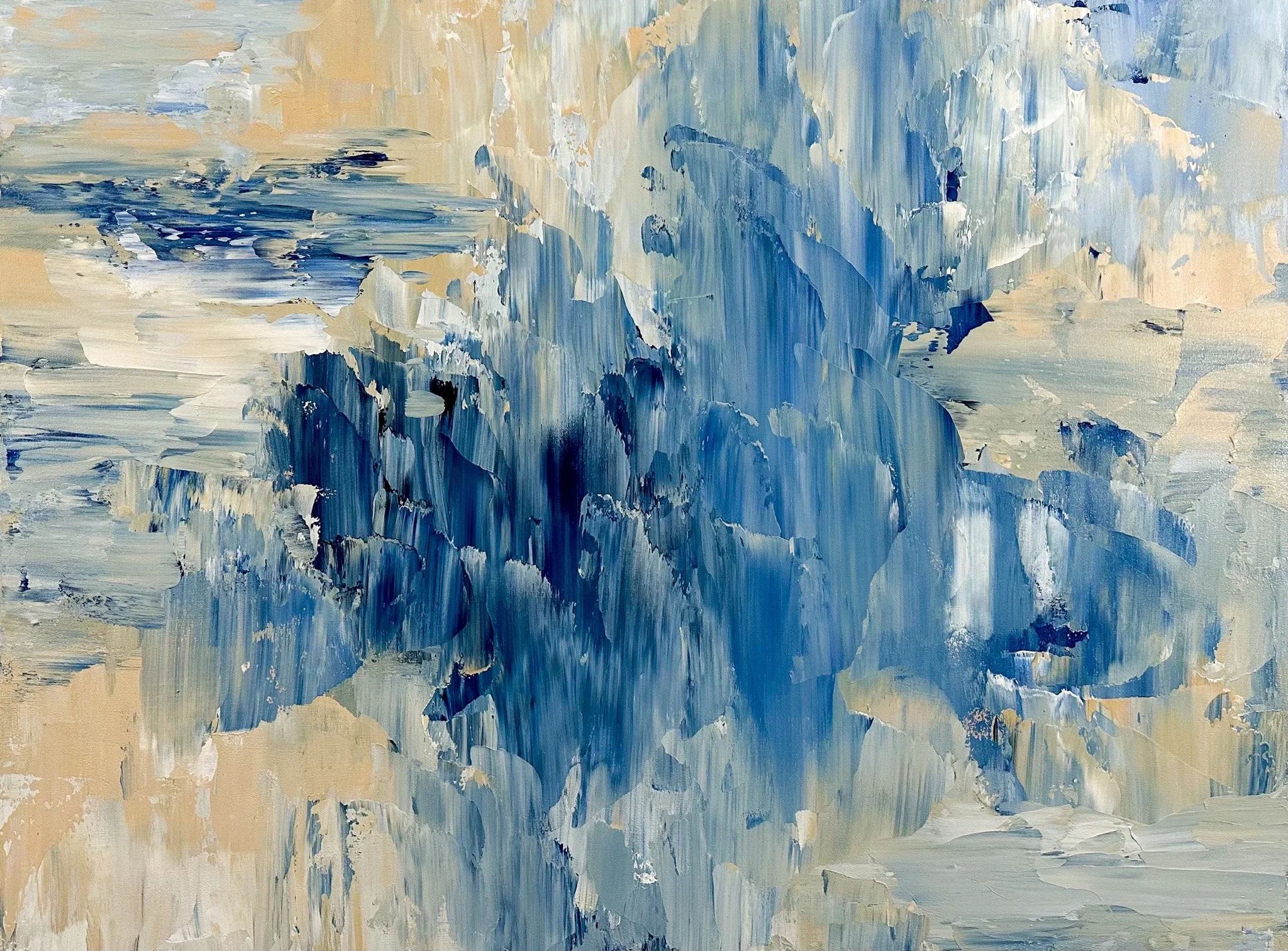
After seeing my evidence-based floral art, many people have a hard time seeing the real inner artist in me. I tell people—all the time—that I am much more of an abstract artist inside and that I just love painting abstract water-inspired scenes.
This goes back to my childhood art lessons. I was first trained as an artist at seven or eight years old, often right on the shores of the Atlantic Ocean in Rockport and Gloucester, Massachusetts. The two artists who trained me were trained by Roger William Curtis, a famous New England seascape artist and the director of the North Shore Arts Association for many years.
When I think of water and art, my first thoughts are often of the ocean waters I learned from, which I associate with primordial power and violent movement.
For evidence-based design art, however, I calm the water and make the composition happy.
In the video there are examples of this.
In November 2025, two abstract, water-inspired paintings were included in the international curation, “The Weather Inside Us,” curated by Nam NK, India and the United Arab Emirates. Both paintings, Power Rhythms and Beauty In Chaos, are abstract expressions of my experiences with ocean water. (Power Rhythms is for sale through Singulart.com, and Beauty In Chaos was sold to a new client the very first time I showed it publicly.) Both paintings express water but with more vigor and power.


Click on the image below to view the international curation.

Artistic And Scientific Merit Of A New Design
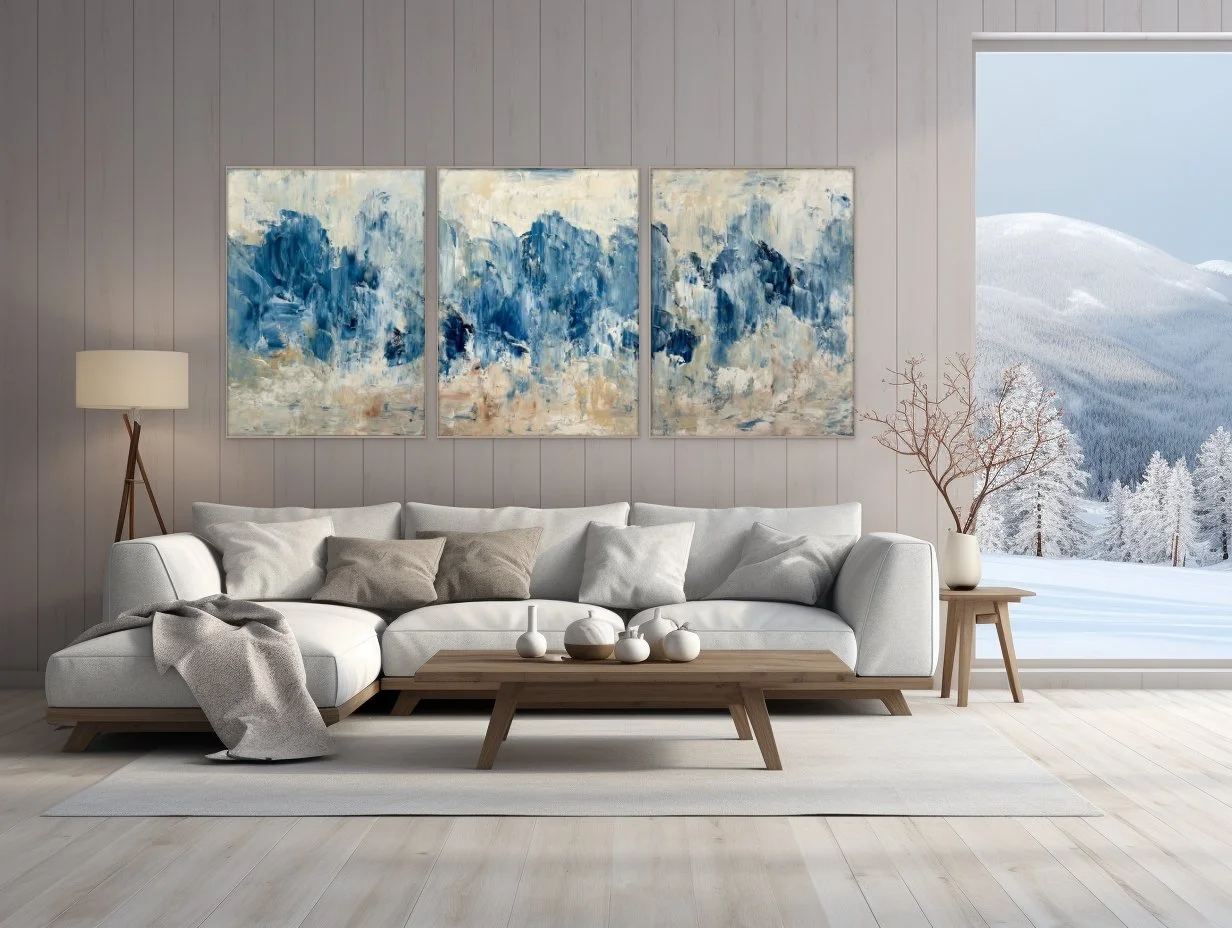
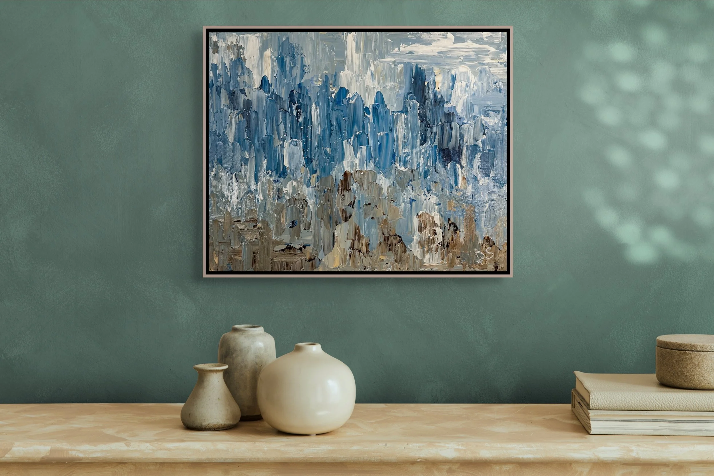
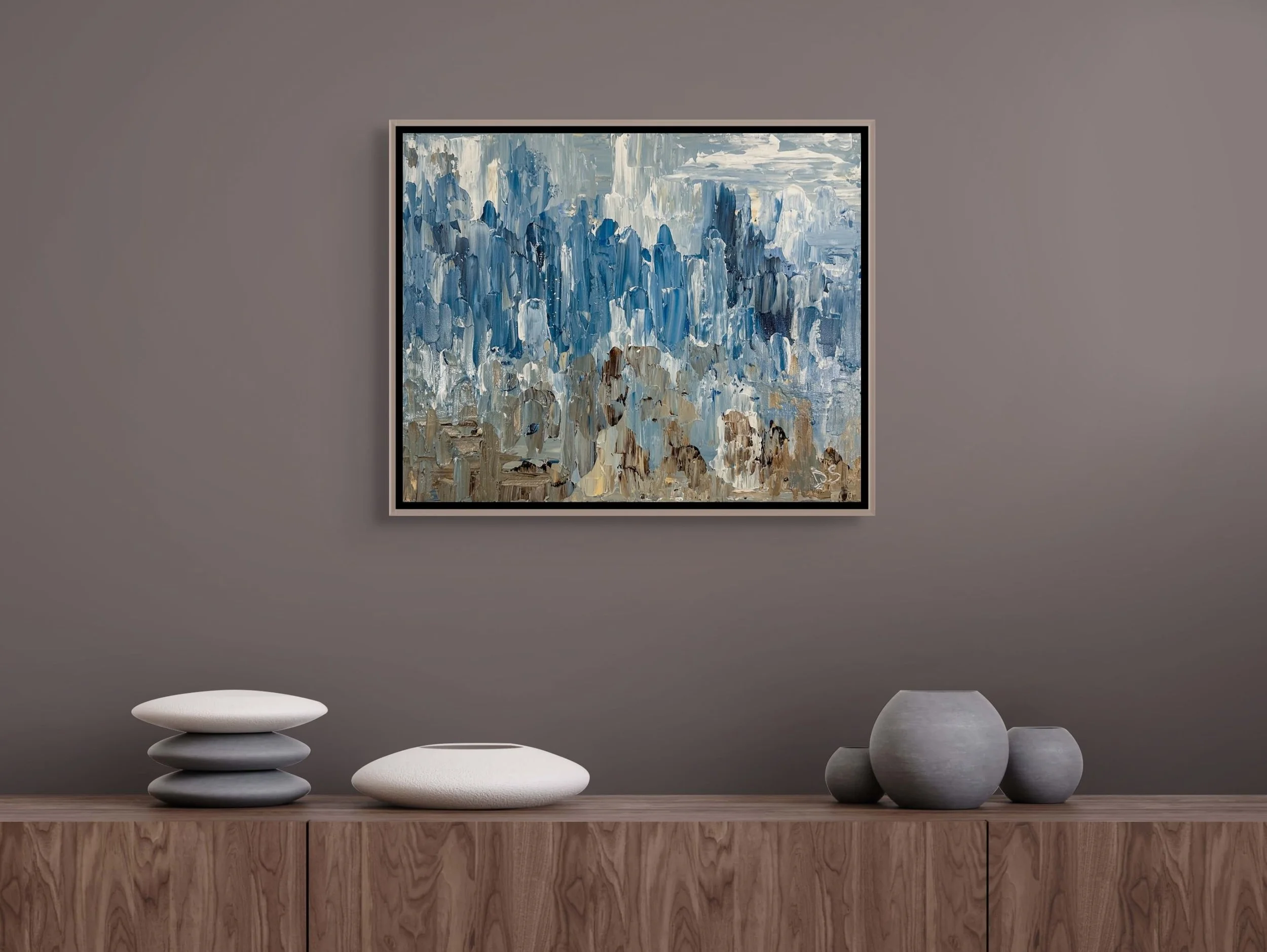
One of my absolute favorite water-inspired paintings was a 3-canvas composition I called JOYFUL TRIPTYCH.
At the time of its creation, I was EDAC (evidence-based design certified), and I was experimenting with creating an abstract work of water-inspired art that would also lead the brain to produce calming as well as pleasure/happiness chemicals.
I wanted water and movement (but not too much movement, which might trigger a bladder) and I wanted viewers to experience a sense of joy but also stability.
Up until this point in evidence-based design research, abstract art was frowned upon and discouraged. I wanted to see if I could create something that was in the abstract category but also acceptable (at least marginally) as evidence-based design.
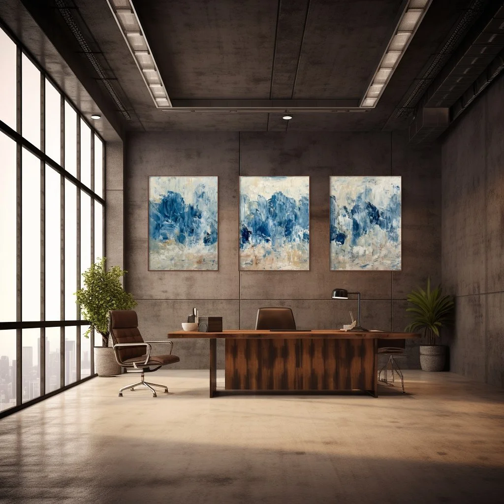
Joyful Triptych by Dorothea Sandra, EDAC (SOLD)
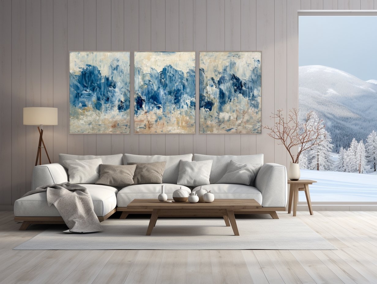
Even though this triptych was water-inspired, it fit right in within a snowy mountain setting.
What I love about it is there’s beauty and drama (artistic merit) as well as (through color, palette knife movements, and evidence-based design knowledge) brain chemicals producing happiness and tranquility (scientific merit).
I am also very happy and honored to announce that I will be in amazing, beautiful, and fabulous Shanghai, China from the middle of February 2026 to the middle of May. I will be staying and painting at the Swatch Art Peace Hotel. If you are in this area during this time, please don't hesitate to visit with me.
I truly enjoy meeting new people!

Scientists, Researchers, And Art
I get told—all the time—how my art is beautiful and how happy it makes people feel. This is true, but there’s a deeper story here.
Hidden away from the public, and often in research labs and scientific facilities, are the many people who have dedicated themselves to the study of human health and happiness. They are doctors, researchers, scientists, and more, and I like to read their research results and then transition what I have read into a work of art.
I don’t mind taking credit for being a talented artist, but I never forget all the hours and days and years of intelligent scientific thought and methodology that went into the medical and scientific study results that I read and then use inside my art.
I also like to experiment. Here’s my latest painting using many evidence (research)-based design strategies and suggestions.

Happy Sustainable Melodies by Dorothea Sandra, Acrylic on canvas, 5’x8’
In evidence-based design and art, local scenery is often suggested. Instead of focusing on a snapshot of a local scene, I chose to take in an entire journey within a local area and represent it through art.
This painting was inspired by nature and a trip I took from Pasadena, California, along the super busy Foothill Freeway on my way into the desert area near Palm Springs.
To be exact, in Pasadena, I got on the 210 Foothill Freeway, with the thickly wooded and dark green San Bernardino Forest on my left. As the highway transitioned to US Interstate 10, it started raining, and suddenly, 10 lanes of headlights came on. It was bumper-to-bumper and stop-and-go traffic for a while, and then the rain stopped and the traffic eased up as I entered the California desert area. Still on Interstate 10, I could see Mt. San Jacinto and then the Santa Rosa and San Jacinto mountains in the distance.
In this painting, I chose the cheerful colors of yellow, muted pink, and orange to represent the mountains.


There is an abundance of sand in the desert, so I used Liquitex’s professional-level unbleached titanium/beige (with a touch of gold) color for the painting’s sky and background.
In evidence-based design, you don’t have to represent everything realistically: for example, you don't always have to create a blue sky.
Every two years, the Center for Health Design requires its certified members to take additional evidence-based design courses in order to recertify. This year, one of my selected CEU courses was The Changemaker-A Pioneer Connecting Art, Medicine, and the Advancement of Evidence-based Design. This course was about Dr. Henry Domke, a physician and photographer. For over 20 years, Dr. Domke practiced as a family physician, which gave him firsthand insight into the stress and anxiety experienced by patients and their families in medical facilities. His healing intent is to use art to create a "healing tone" that provides comfort, reduces stress, and offers positive distractions for patients, staff, and visitors.
Something he said in the video—and I agree with and use all the time in my art—is that an evidence-based design’s composition and focus should not be about the artist. When I paint, it’s not about my ego or my self-glorification. An evidence-based design composition should be created with the patient's needs in mind.
Happy Sustainable Melodies was created as a fun, almost whimsical work of art that reflects a local scenery adventure. With its bright, happy colors, playful stem arrangements, and splashes of green impressionist flowers, it’s also a happy distraction piece.

The brilliant blue color was used to represent a gap between leaving the 210 Foothill Freeway, with its deeper dark colors and thickly populated area, and entering the openness of the desert.


The darkness at the bottom of the painting represents beginning this artistic local scenery journey at the deep-colored and green San Bernardino Forest area. The many plant stems going in many winding and different directions reflect the lanes and lanes of traffic coming in and out, as I traveled on these highways. Midway in the painting, the various colors leading to the desert area show how the scenery transitions from one type of landscape to another.
For people/patients who know the area, this painting—in a fun and happy abstract/expressionism/impressionism style—reassures and comforts and recenters them by visually connecting them to their nature-filled and sustainable beautiful local scenery.

And most importantly, this painting never would have been created this way—at least not by me—without all the hard work and loving dedication of doctors, researchers, scientists, and more.


Is Evidence-Based Design Legitimate Or Just Another For-Profit Buzzword?
Not long ago, I left a positive comment about a Dopamine Decor article at a homes and gardens magazine. Then, I got attacked by some troll saying that Dopamine Decor was just some new way for companies to make money off people.
Usually, I do not get involved with things like this, but I felt a strong urge to explain that a lot of Dopamine Decor and Evidence-based Design art is based on real, authentic, legitimate science and medical studies.
In my book, 100 Days Of Happy Happy Art, Evidence-Based Design, I wrote: “From the 1960s until today, serious researchers with very serious studies…from different countries…from different multidisciplinary fields have converged to create a new field called Evidence-based Design.”
Even the National Library of Medicine at NIH, the National Institutes of Health, has a definition of it. “Evidence-based design is scientific analysis methodology that emphasizes the use of data acquired in order to influence the design process in hospitals. It measures the physical and psychological effects of the built environment on its users.”

In cancer center lobby.
Today, Evidence-based Design isn’t just for hospitals. It’s for all of us. It is for many of the places humans go.
What is my role in all of this? A very small one—but I think an important one. Today, my art hangs in hospitals, businesses, organizations, and homes. Using my talent and evidence-based design training and certification, I very deliberately and very strategically create HAPPY HAPPY HAPPY art for built environments.
Here’s one of my paintings as it hangs in the lobby of a cancer wing in one of the U.S. hospitals.
The person in charge of art placement at the hospital apologized for its location on a side wall in the lobby.
She thought I might be offended by not having it centered over the main mantlepiece in the waiting area. I wasn’t offended at all. In fact, people come face-to-face with it as they enter the blood draw area. Putting all artist ego aside—and focusing on patient/people needs—I thought it was perfectly located.

Too Beautiful For Words, 36”x36”

Too Beautiful For Words is a super cheerful “distraction” piece. Getting cancer and getting treated for it is often horrific, and at times, it can make patients and others feel as if they are about to lose their minds or are living through some “other world” reality. I thought adding an upbeat quirkiness to the art would help—in a positive way—identify with the circumstances and would also help release some dopamine (happiness brain chemicals).
Patients, their families, and the staff kept telling me—all the time—how happy this painting made them feel, so I decided to donate two other paintings that evolved over the years into a new evidence-based design series called Symphonies of Love.
Both paintings below are placed today in cancer patient examination rooms. People in this community with cancer or with a loved one with cancer continue to tell me how much they appreciate the heart shape, which simply but beautifully communicates to patients that they are loved.
One of these 61” x 78” evidence-based design heart paintings recently got featured on one of the world’s most prominent online art gallery websites. I was listed as one of sixty-one American artists to follow.

In patient examination room #1.

In patient examination room #2.
Click on the photo below to go to the website.


Different Types Of Evidence-Based Design
There’s Evidence-based Design, and then there’s NOT Evidence-based Design.
Here are a few evidence-based design art guidelines. Many of these guidelines come from “A Guide to Evidence-based Art” from The Center For Health Design, research by Ulrich and Gilpin, a case study on best practices in evidence-based design by the Mays Clinic at the MD Anderson Cancer Center, and so much more.
Landscapes
They can be regional, generic, or seasonal. They should have visual depth or open foreground. Trees should have a broad canopy. Savannah and park-like landscapes are preferred by many. Vegetation should be lush. Empty park benches and sunsets should be avoided. The empty park bench might remind someone of loss and loneliness. A sunset might represent the end of life.
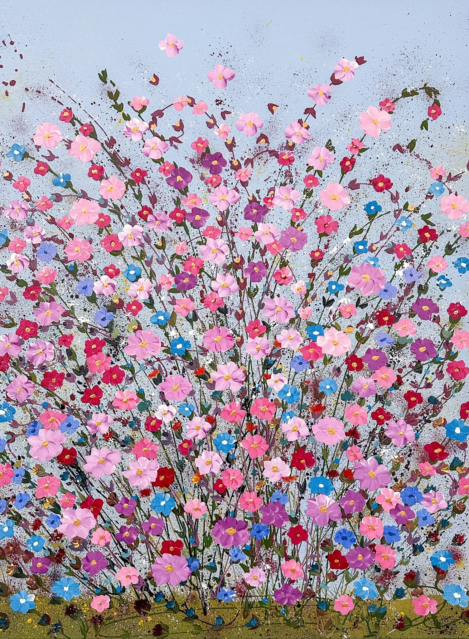
Florals
Florals should include familiar shapes of plants and flowers. They should appear healthy and fresh, and flower colors should be vibrant. Gardens and bouquet styles are acceptable. Flowers in vases should be used sparingly and only for variety.
Taking scientific or medical study results and turning them into artistic creations is not the easiest thing to do. There are no step-by-step guides to follow, and the rules need to be there, but sometimes they need a little bending.


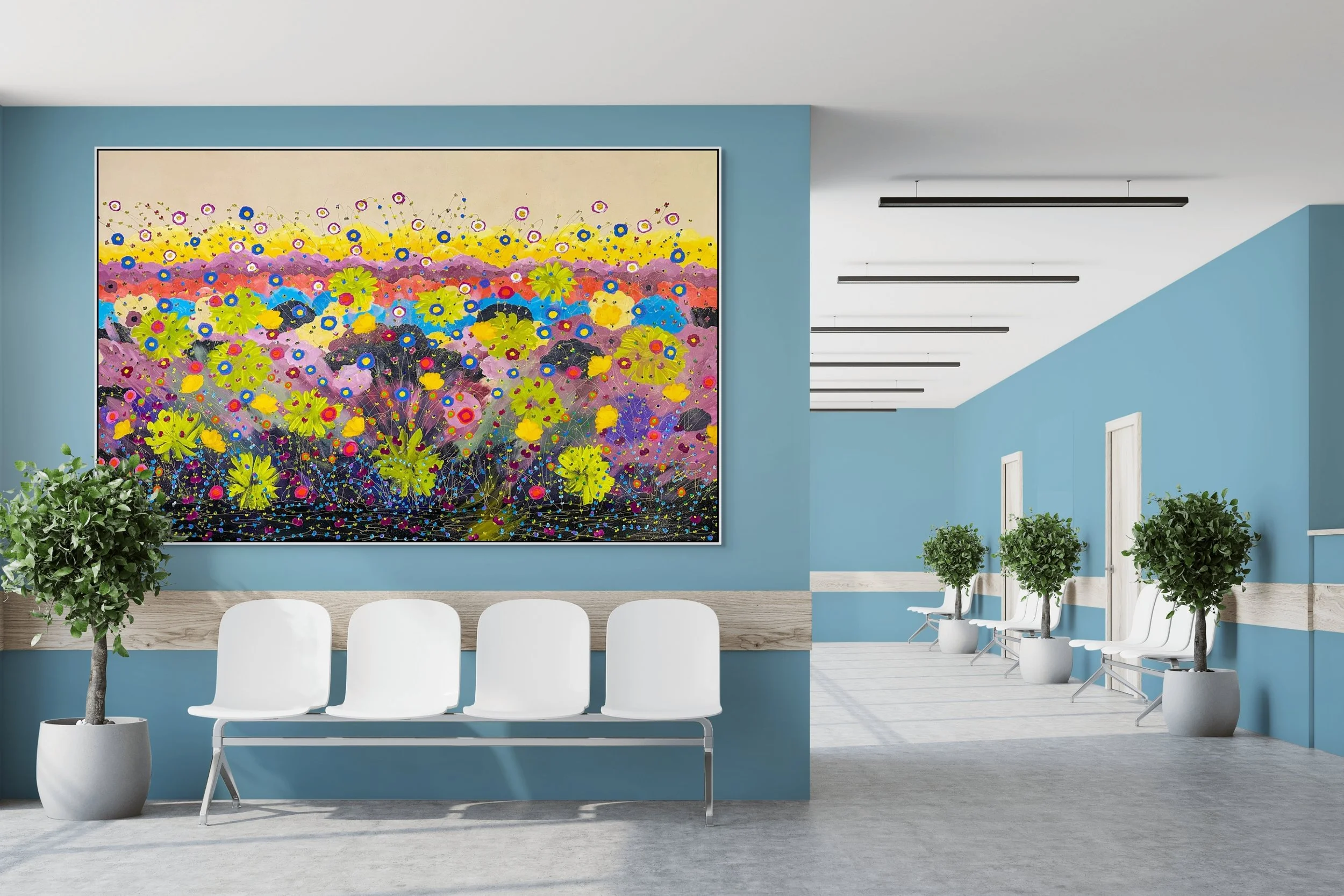
The painting above, Healing Flowers, spent time on exhibit in a museum and then in a gallery. It recently sold, in 2025, to an art collector in Fort Worth, Texas. Also, in Jan/Feb 2025, it was featured on the cover of Healthcare Design Magazine. In addition, in 2024, I was also asked to show it in another issue of Healthcare Design Magazine issue. On one international art gallery website, this painting received thousands of views.
While creating it, I tried to adhere to the evidence-based landscape design guidelines for healthy outcomes. By following the rules, I figured I could trigger the brain to create dopamine, which would produce in its viewers feelings of happiness.
If you look closely, you can see through the stems, which gives viewers visual depth. According to the research, seeing through the stems helps humans feel safe. It takes us back to our days of hunting on the Savannah, where dangerous animals could hide in thick grass and then attack us. While the stems were thin, I ensured the flowers appeared lush and abundant. Again, this would suggest an abundance of food.

Healing Abundance by Dorothea Sandra, EDAC
Using the same evidence-based design guidelines, Healing Abundance also sold in early 2025. It was sold from a gallery in Paris, France, and shipped to a company in Hong Kong with television channels in Hong Kong, mainland China, Macau, and other Chinese-speaking areas. The soil and stems are there, but I wanted to add lush vegetation through the flowers.
Years ago, when I was living in Asia, a good friend who was also a medical doctor ended up in the hospital. I went to visit her with a bouquet of cut flowers in hand. After she got out of the hospital, she told me that a bouquet of flowers was not the best gift. A potted plant would have been more appropriate. When I asked why, she explained that cut flowers will soon die, while a plant in soil continues to live on.
Most everything I do in the creation of an evidence-based design painting is for the health and happiness of viewers.


Why Did I Become Evidence-Based Design Certified?
A couple of years ago, I was on a very popular—and seemingly legitimate—New York City art website that was promoting art for health and healing.
Get this—misshapen and horrifically disfigured images; spread open naked human legs and rolls of unhealthy body fat; abstracts of daggers and dripping blood—all amazing works in their categories—just nothing I would consider appropriate for the elimination of stress or the recovery of human health.
This set me on a course for knowledge. I wanted to discover if I could actually learn to design/create with your health and healing in mind. I found The Center For Health Design with its excellent EDAC (Evidence-based Design) courses and certification. Imagine thousands of doctors, hospital administrators, health facility architects, hospital room designers, and many more professionals worldwide basing their creative/artistic decisions and designs on actual medical studies.
Instead of some untrained art critic or consultant setting the standards for art, health, and healing, I now had real medical professionals to learn from and follow. The EDAC exam was the most challenging test I ever took (and I’m a university graduate with high grades), but the knowledge I gained—which I now incorporate into my designs—was absolutely worth all the hard work.
It’s amazing how many people who buy my evidence-based designs tell me how this “evidence-based” art actually shifts their moods and creates positive and uplifting feelings/states of mind.
Here are four examples of what should never be promoted as evidence-based art for health and healing. Two of the pieces sold within minutes to a collector. They had merit, just not as evidence-based design art.


The first painting is titled Anguish and is part of a series I created about child abuse. This painting artistically reflects the mental and emotional suffering that children experience when they are not nurtured in healthy ways.
The second work, Killed Opportunities, shows how barren and tragic a child’s life becomes as opportunities for health and happiness are killed.
The third painting, Death By Power, reflects negative power winning. The face of a hideous creature looking at the viewer (top center) and a hand with the middle finger raised up (lower center) are perceptible.
In February 2025, I sold The Tempest, the fourth painting, again to a collector.
All four paintings have merit as works of abstract art. The art itself, however, does not de-stress or promote health and healing. In fact, it does the opposite.
Can you imagine the added stress and trauma of looking at any one of these paintings while recovering in a hospital bed? Before training to become evidence-based design certified, I wondered why influential people in the art world were calling paintings like this art for health and art for healing. It just didn’t make any sense to me.
Here are more beautiful paintings that would not be considered 100% appropriate evidence-based designs. Some I sold, some are for sale through a Paris, France international gallery, my website, Galleri Soho in Sweden, and more.
When I create evidence-based design art, I use design suggestions and strategies based on credible scientific and medical research. I get my information from a variety of sources, but I enjoy and value the trainings (which are required for EDAC recertification) at the Center For Health Design and their journals and repository information.
There’s a difference between pretty art that makes us feel happy and art that triggers our brains to feel happy based on medical and scientific research. Evidence-based design is that kind of art.